2020. The year we introduced the new communication design for the biggest retailer in Switzerland, Migros. The brand strategy was quite straightforward: Simple & Surprising.
So we asked: What does this mean for Design?
We reduced the letter M to its most simple shape. And we call it:
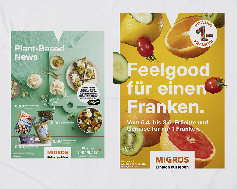
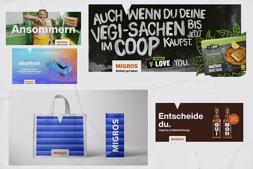
The story behind it: Imagine a theatre. The M-stage is the backdrop. The people and food, are our actors. By positioning these over the M-Stage, we gave the right spotlight to people and food.


This new approach was built by using the fundamental shape of the brand itself.
An elegant system in...
As with all theatres, we needed a show to run.
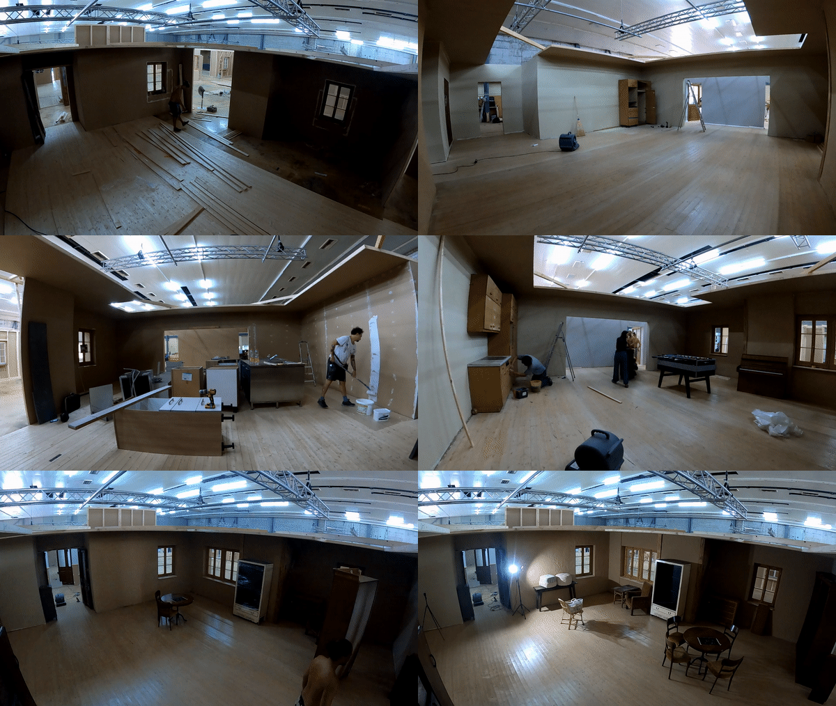
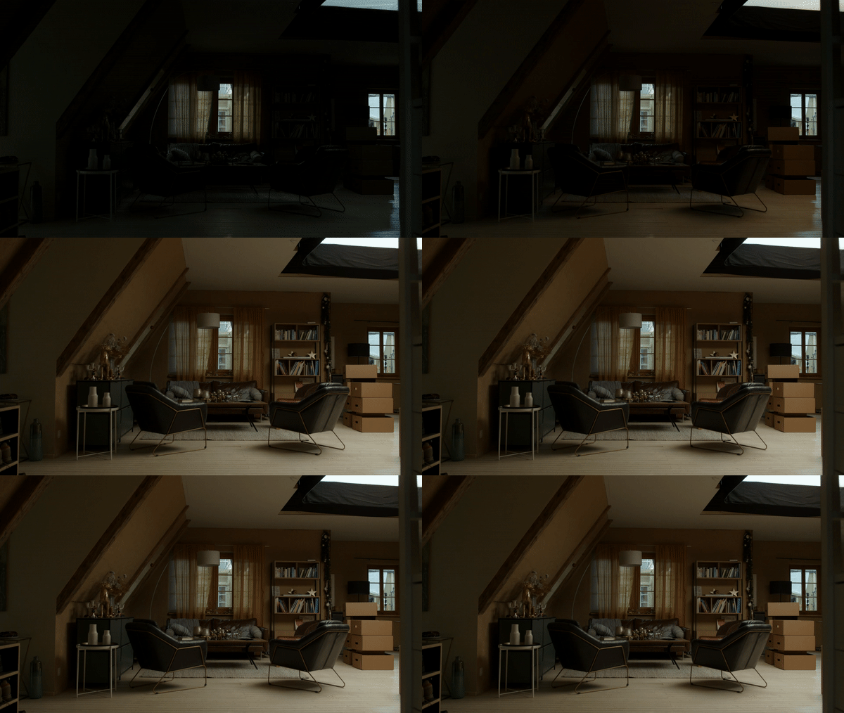
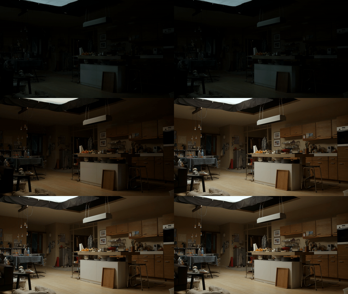
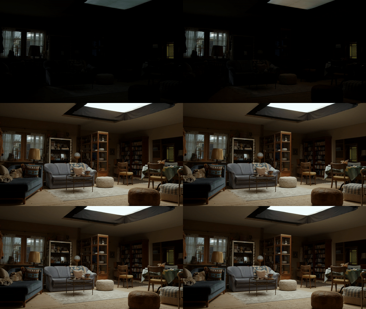
That’s when the Migrocosmos was born.
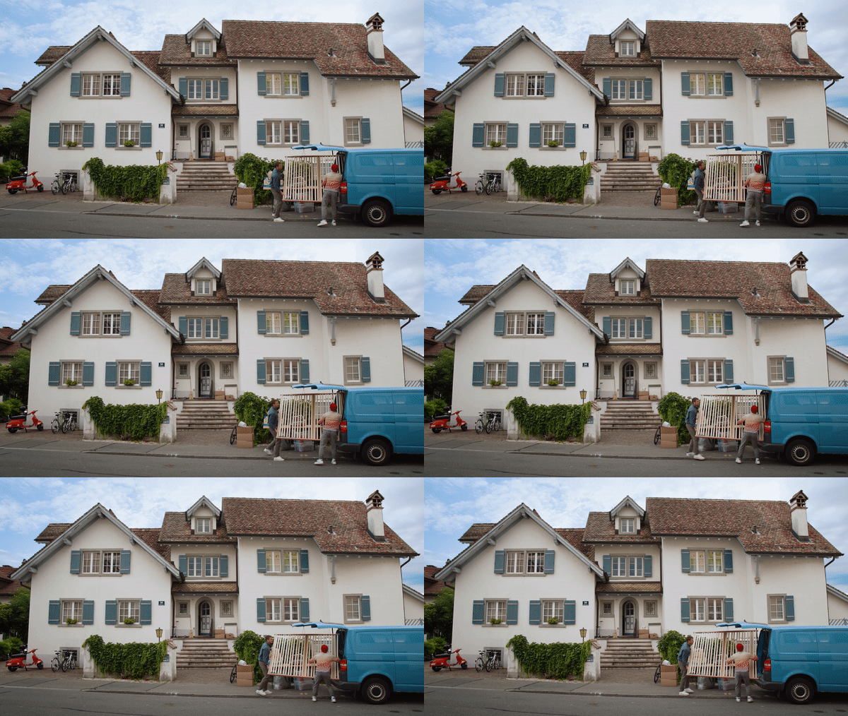


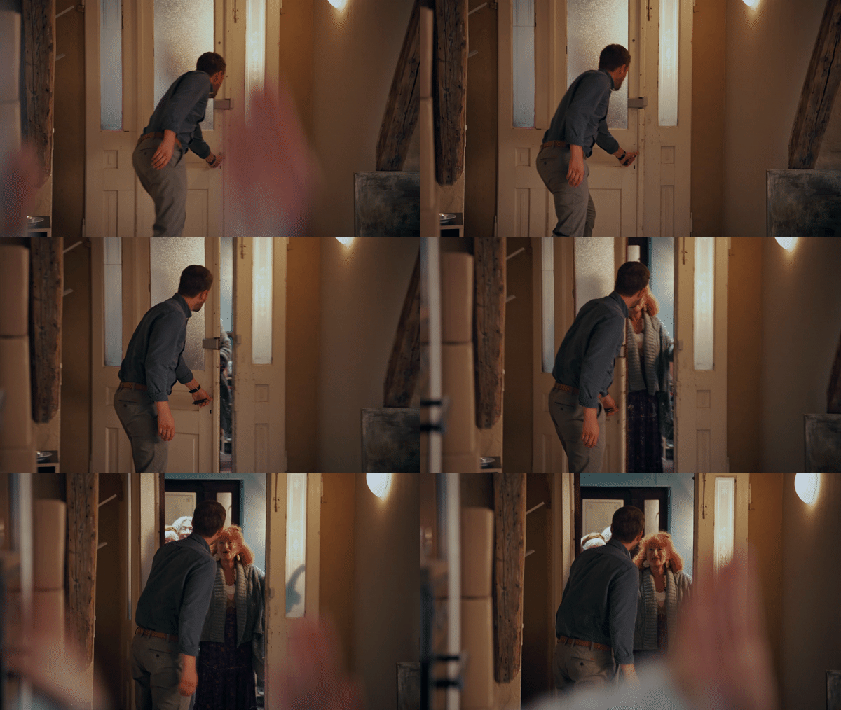
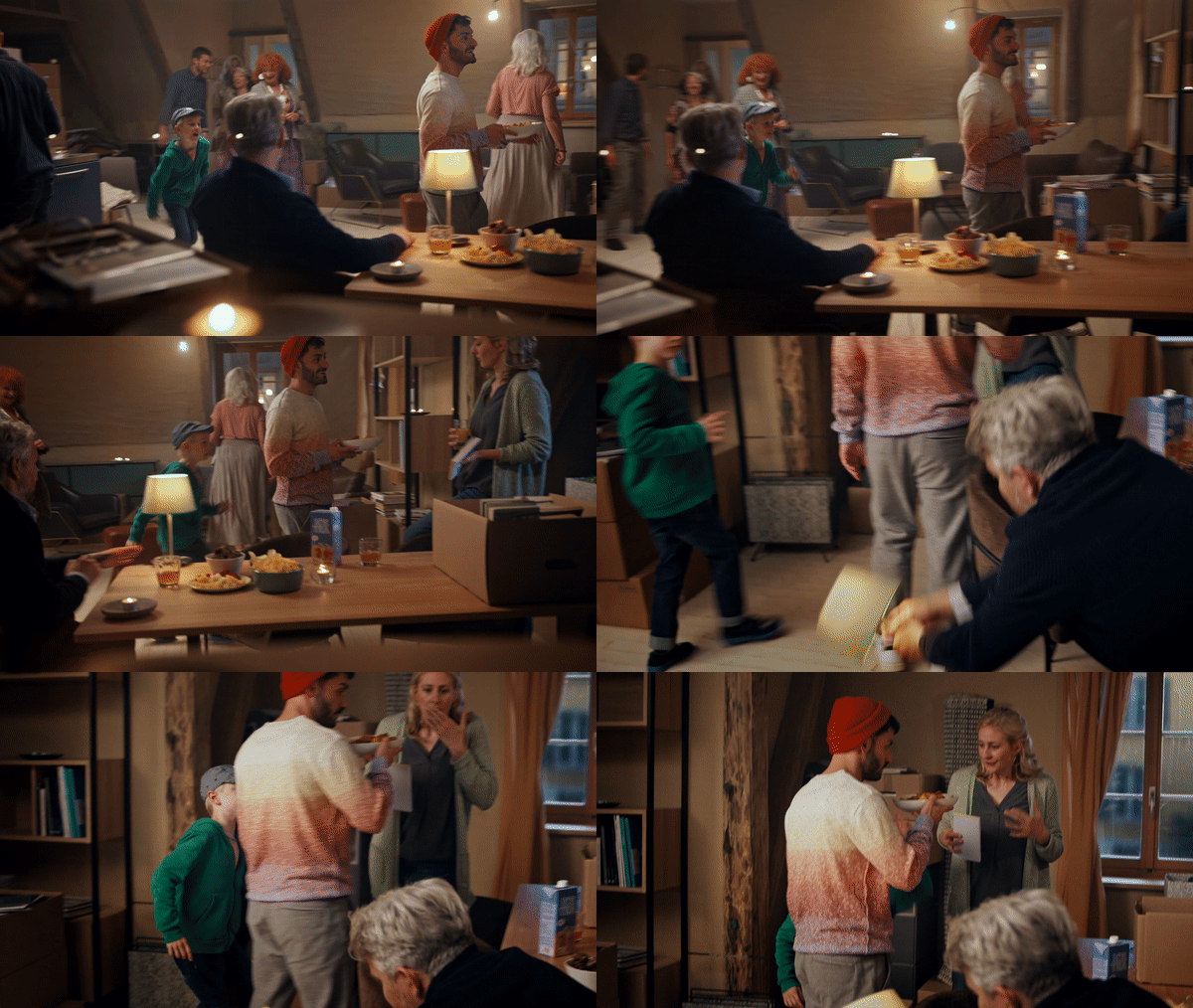
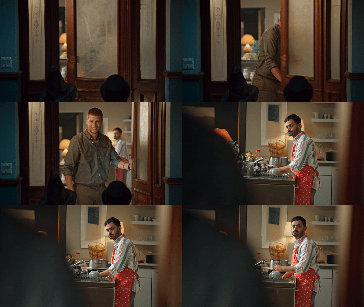
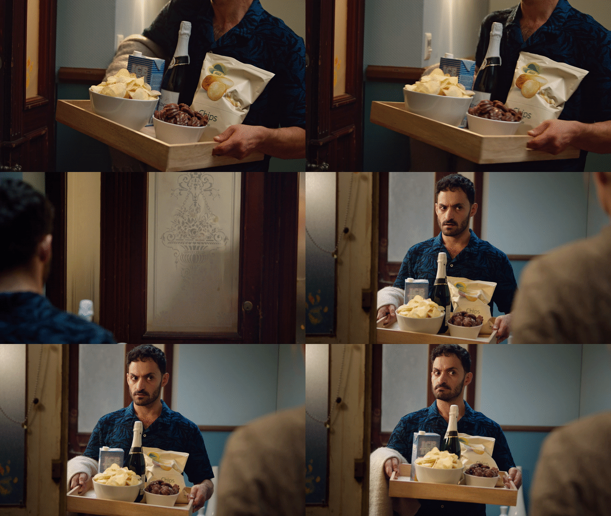
A series ad about a traditional Swiss neighborhood from an apartment with 4 homes with people like you and me. Stories were built revolving around the everyday life of the residents with the Migros branch just across the street.


To wrap it up, a new brand line.
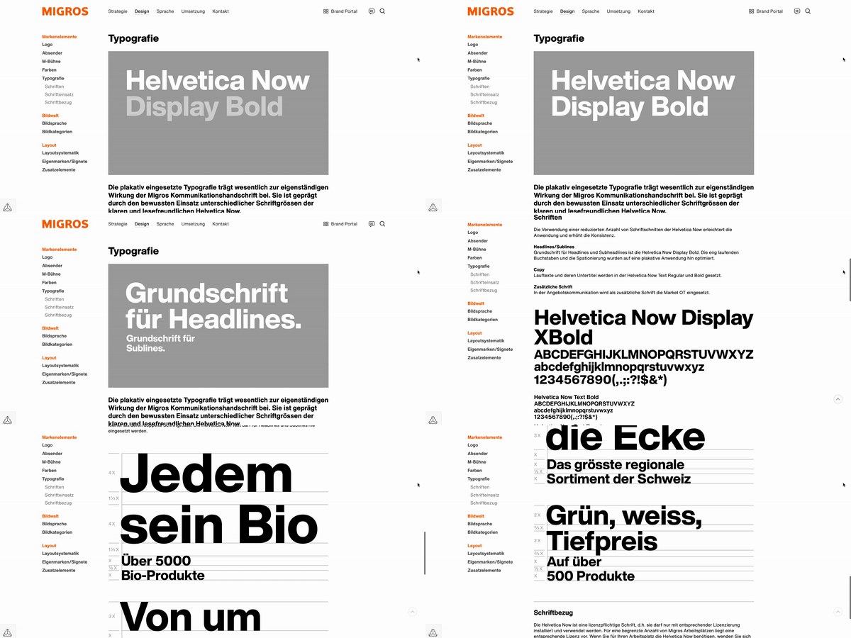
Brand book in a nutshell
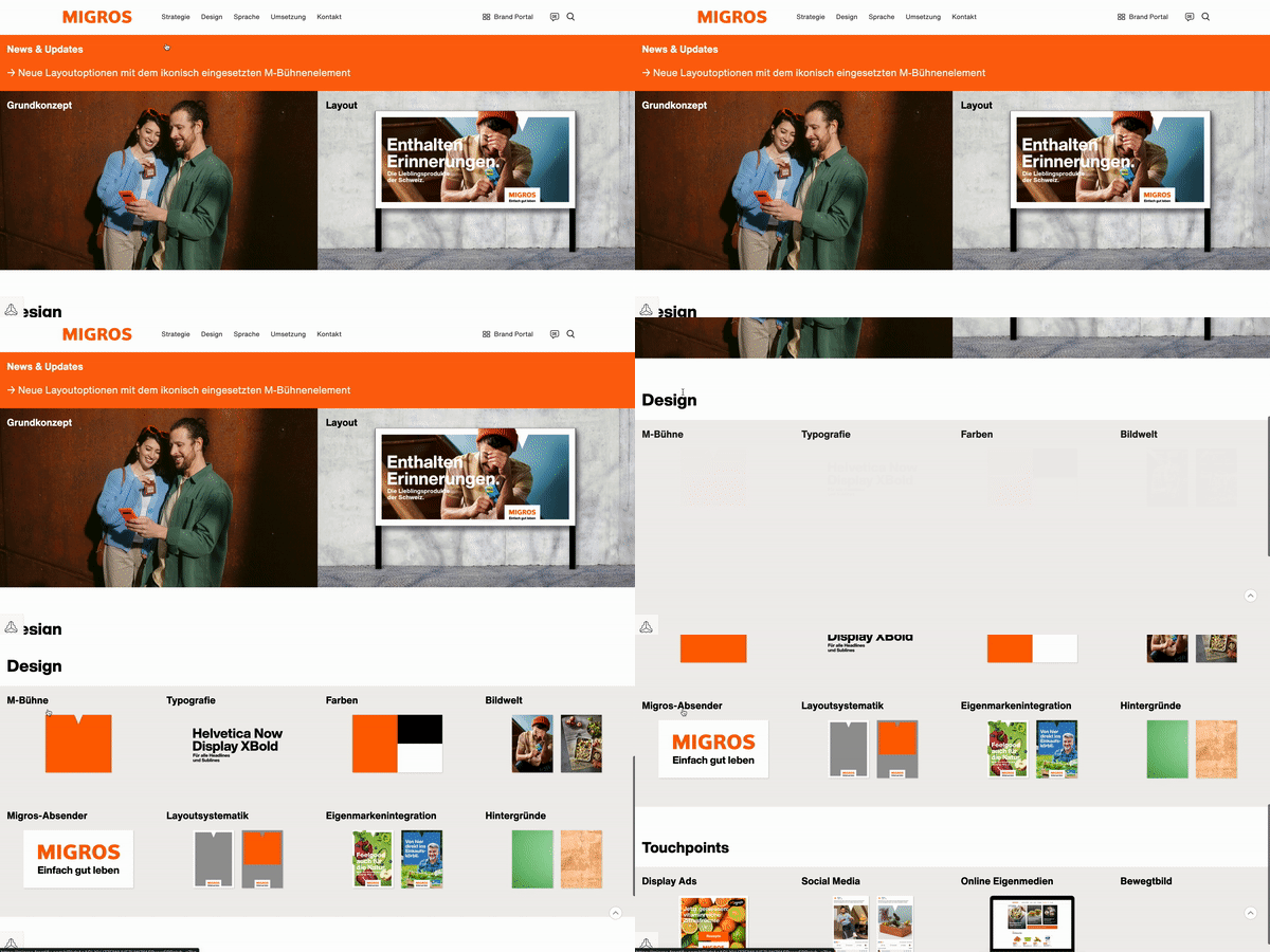
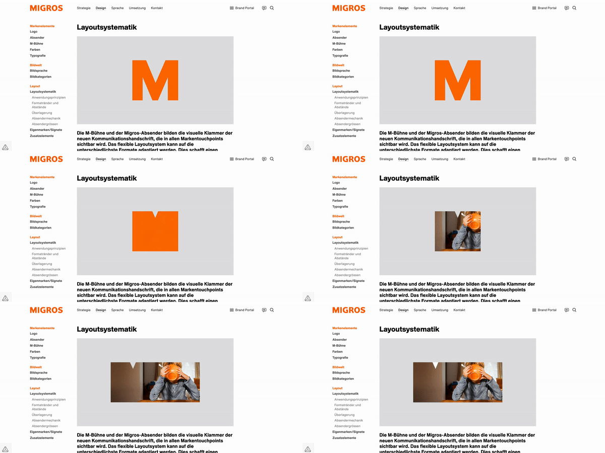
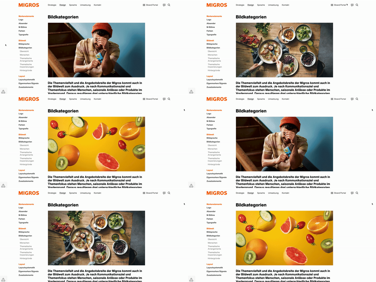
/// A bit of the M-Stage over the last 2 years ///
Everything I’ve done that I’m proud of is because of, a strong collaboration with a team, brave clients, and talented colleagues.