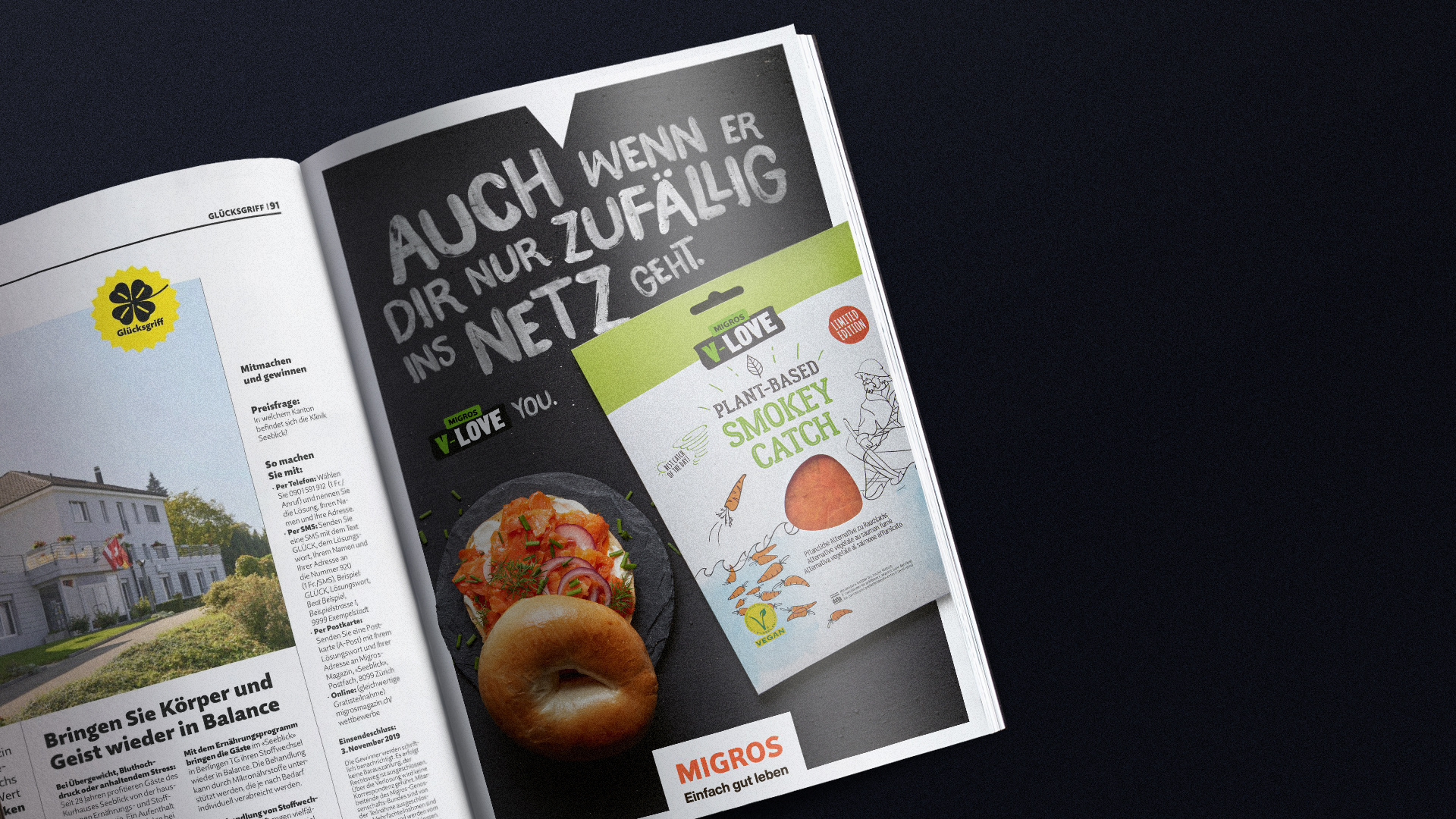
With plant-based diets booming in recent years, it’s easier than ever to find vegan options at almost every supermarket. Shelves are lined with health-conscious, planet-friendly blah blah messages. Rules and rules and more and more opinions. This kind of rhetoric works for most people, and yet not everyone responds as positively – some don’t want to feel as though they are being “lectured” about their food choices. It's in this precisely heated climate that Migros introduced its own brand: V-Love. Whose identity has been built around humor, tolerance, honesty, and without the “do-goodism” these types of consumers usually associate with vegan brands.
V-Love needed to express much more than the idea of selling plant-based products - the issue behind it is very serious: the survival of the entire planet. So, the activism is there, but the idea was to present it in a light-hearted way and with no rules.
Taking inspiration from the art of protest, we created an identity that referenced “the concept of activism”.
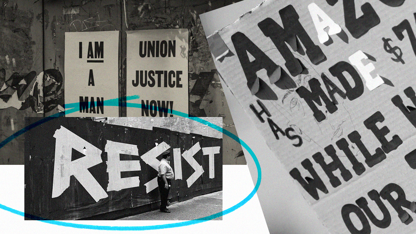
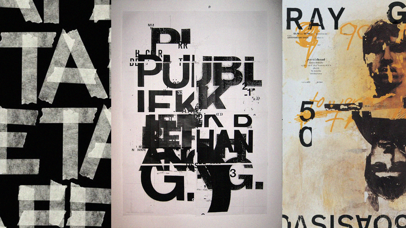
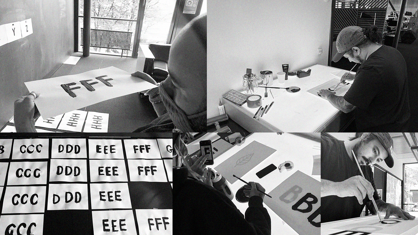
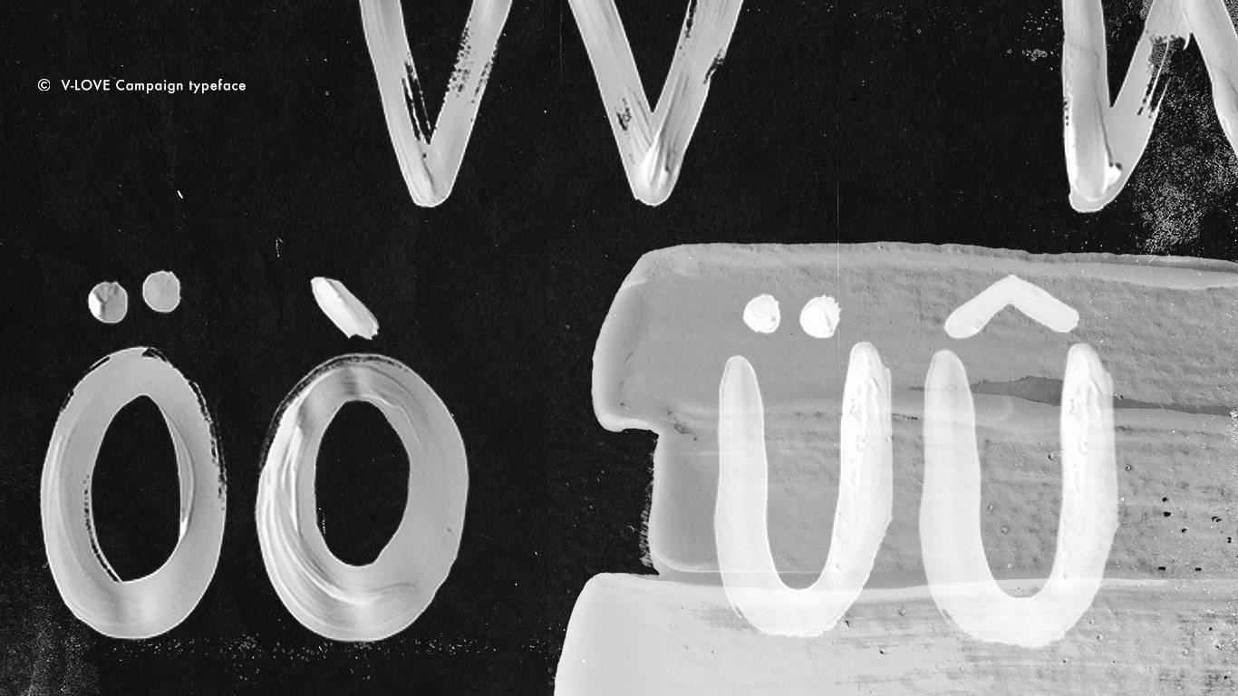
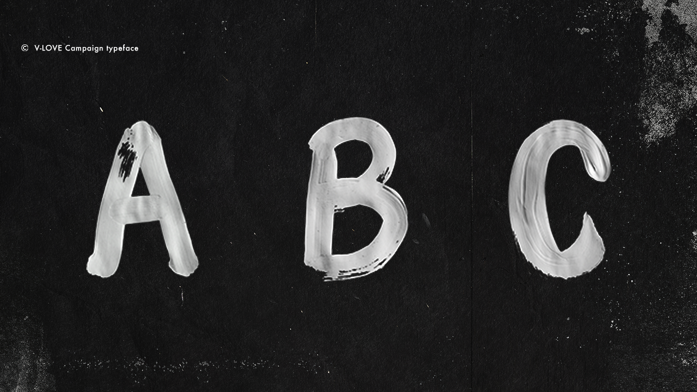
So we got our hands dirty and made hand-drawn lettering made of ink. After this, we digitized and applied the type to a wall texture with the goal to develop an identity that visually reflected the activist values.

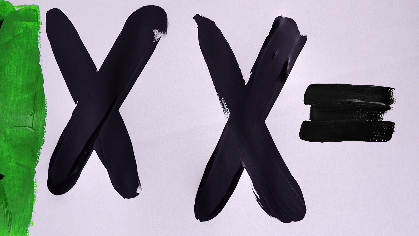
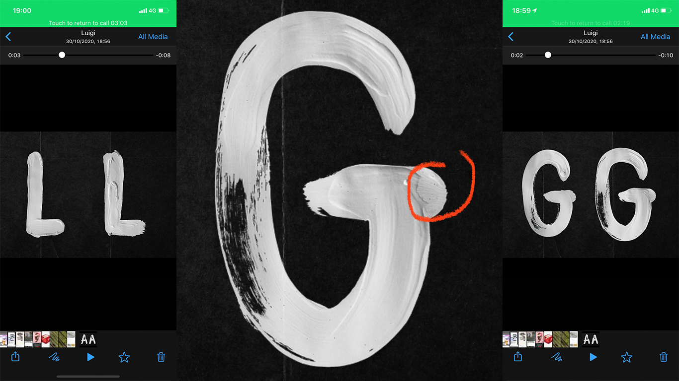
Final Typeface
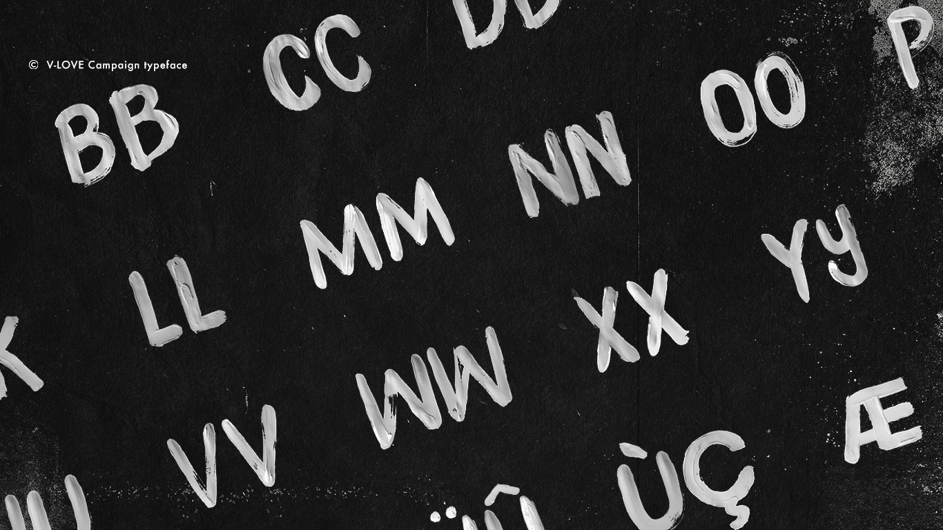
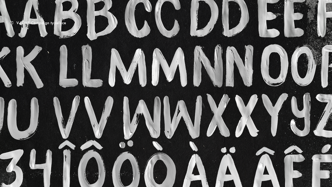
In campaign
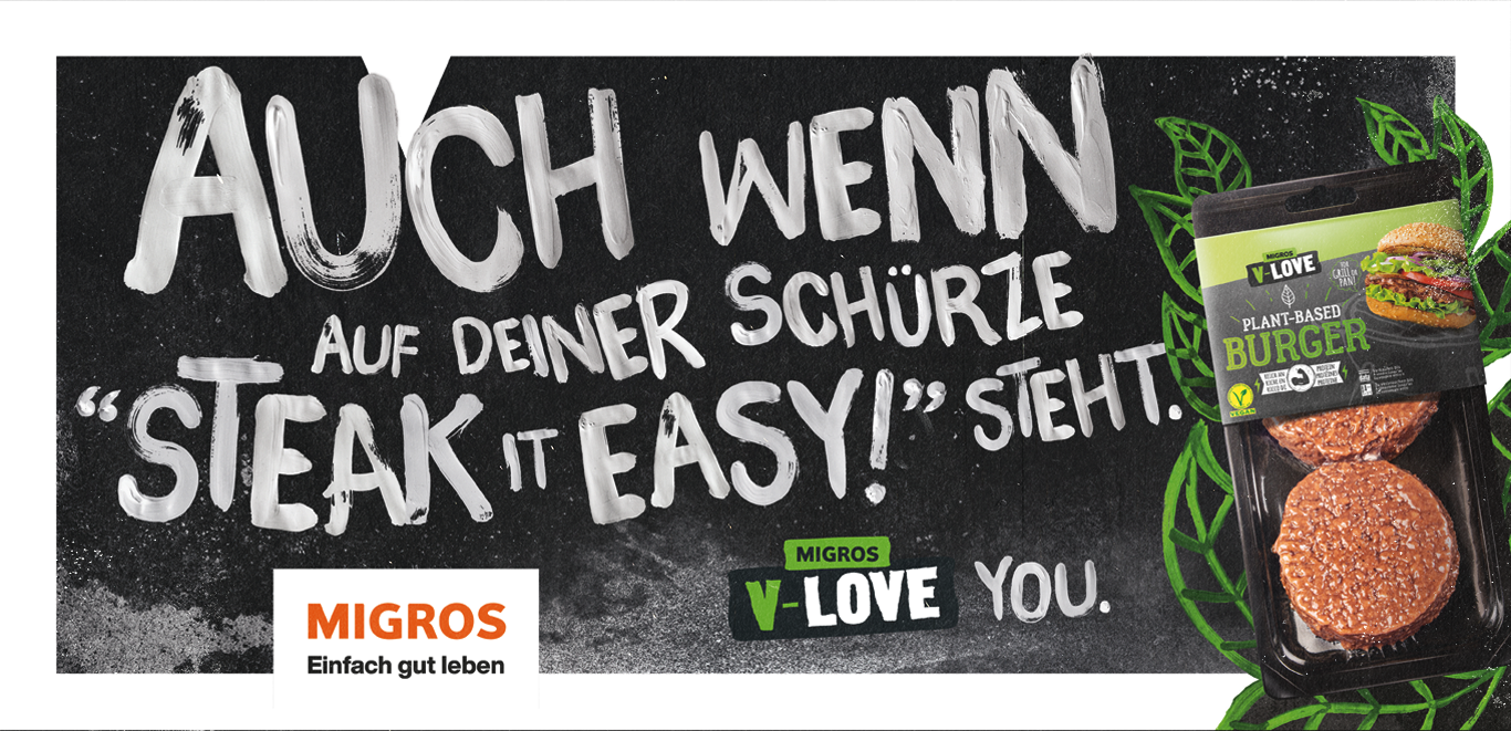
Even if your apron says "Steak it easy!" V-Love YOU.
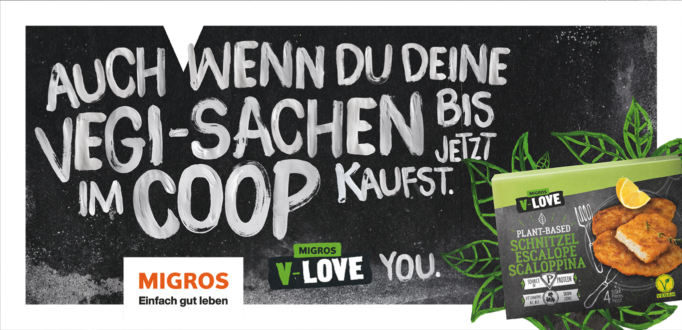
Even if you buy your veggie stuff in Coop until now. V-Love YOU.
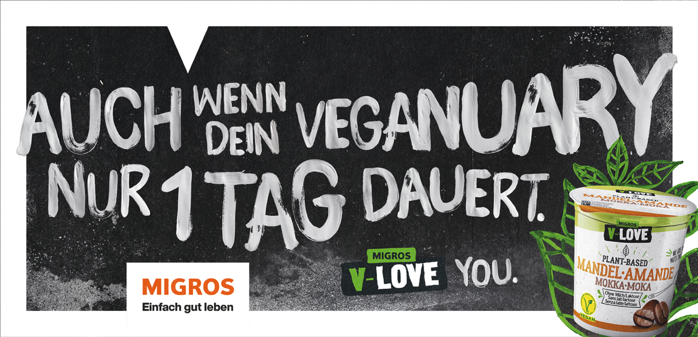
Even if your Veganuary only lasts 1 day. V-Love YOU.
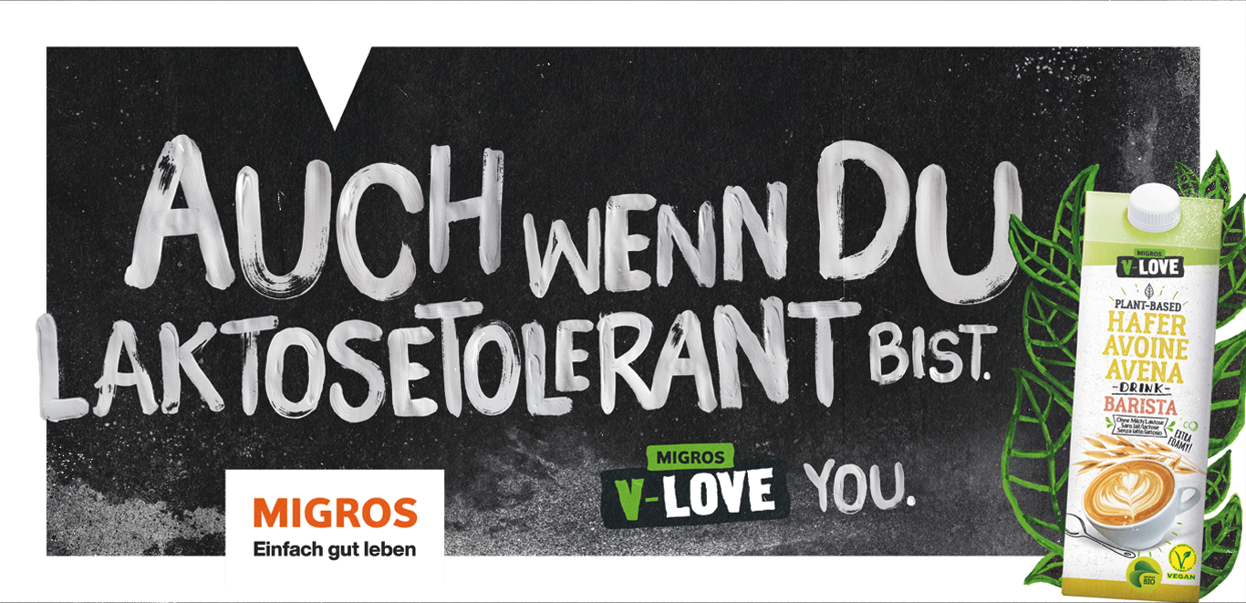
Even if you are lactose tolerant. V-Love you.
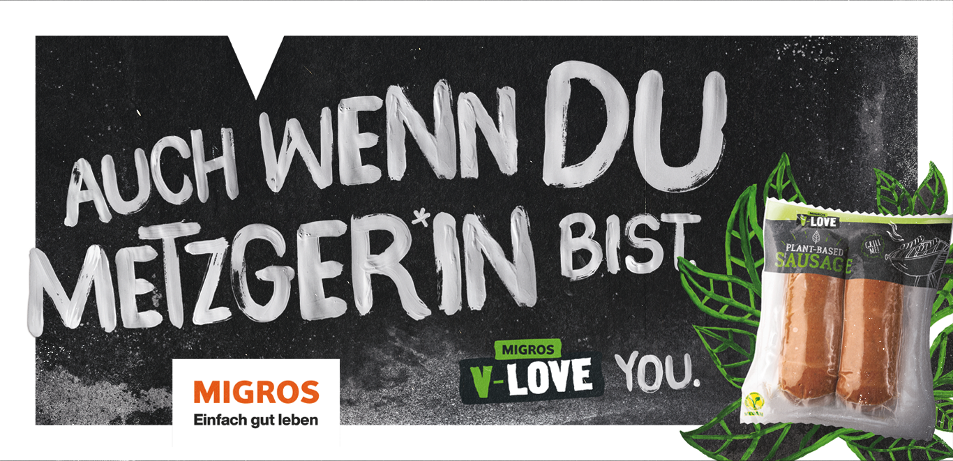
Even if you are a butcher. V-Love you.
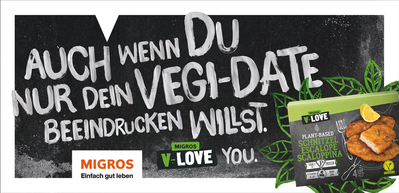
Even if you just want to impress your veggie date. V-Love
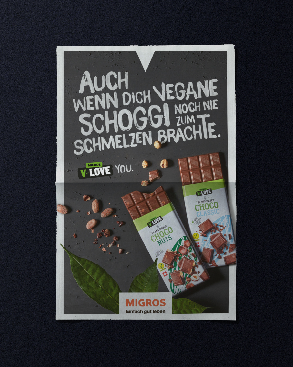
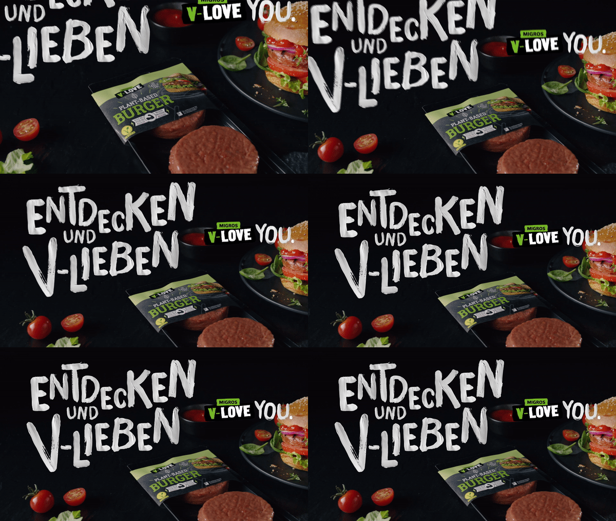
In film
