Light enables us to get started. When light hits us, we feel ready. That is the basic idea of Swisscom's new image world. A concept born by the brand’s umbrella message: Bereit fürs Leben. (Ready for Life)
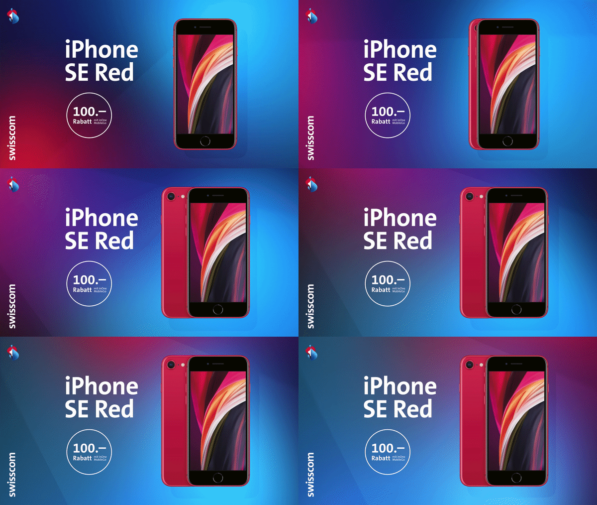
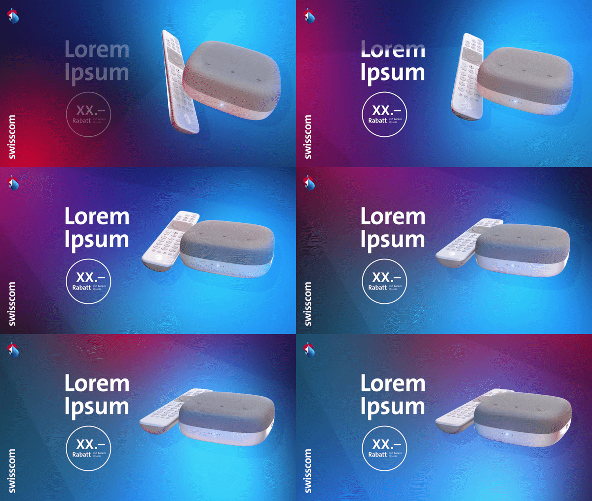
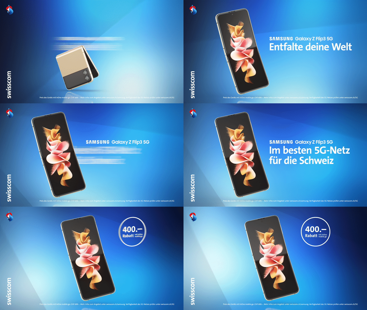
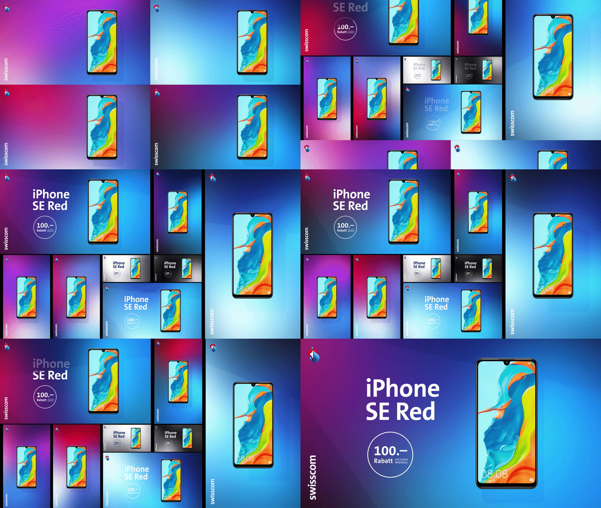
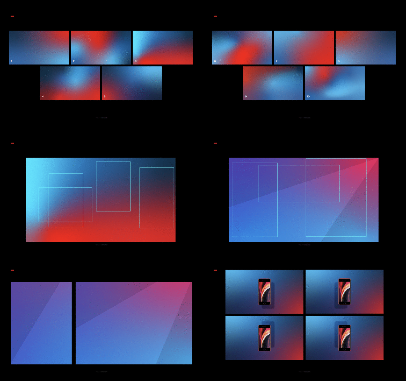
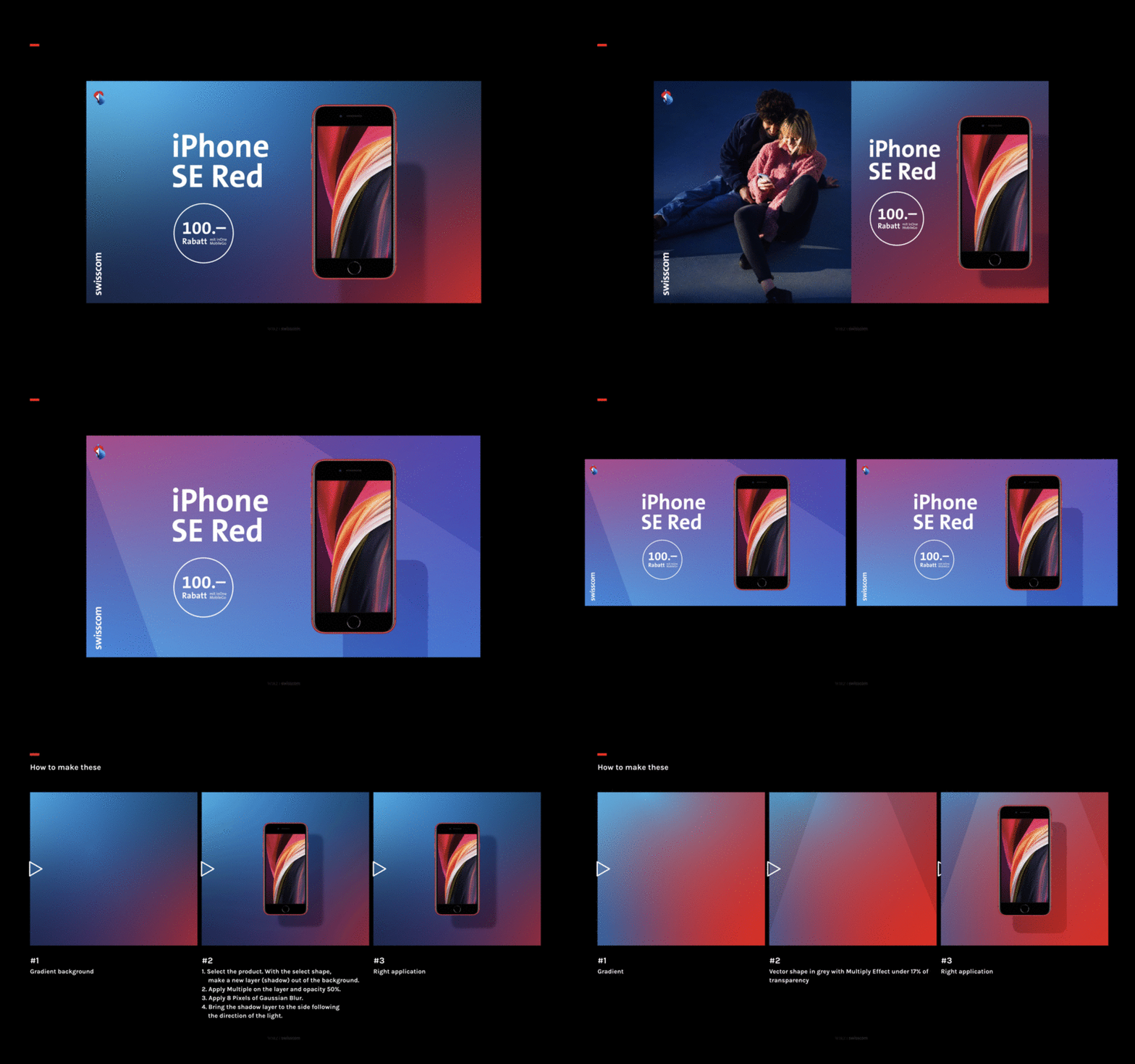
The image composition uses the brand colors to match the time of the year, day, or product. A concept that keeps the brand's visual world in constant change.
Reduced photo backdrops are intended to draw attention to the character and personality of those portrayed in the picture.













The focus of the concept is the use of light on colored surfaces. Light cones and shadows ensure that the concept is also recognizable in purely graphic implementations. In addition to this, the graphic brand elements were supplemented and further developed. Within the Swisscom color world, we created new, suitable background gradients and a set of rules for their use.



The visual identity was developed for nearly 9 months in the Design Lab at WIRZ. This resulted in an innovative, visual language that gives Swisscom an unique visual independence.